Basic Usage
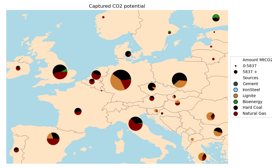
Distribution Data
The data can be created running.
from autumn.maps import PieMap
from autumn.core import cost_captured_distribution
from matplotlib import pyplot as plt

distribution = cost_captured_distribution("basic")
With this distribution you can do various things, one of them is plotting a map.
pie_map = PieMap(distribution)
fig, ax = pie_map.plot_map()
plt.show()
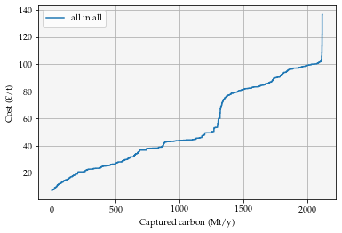
Cost Potential Curves
Before you can start working with cost potential curves you need to import the curve module and matplotlib and create a distribution object.
from autumn.core import cost_captured_distribution, scenario_development_one_hot_encoded
from autumn.plots import produce_scenario_collection
from autumn.data_operations import CostCurve, CurveCollection
import matplotlib.pyplot as plt
Distribution = cost_captured_distribution("basic")
Once you have done this you can create a single curve.
fig, ax = plt.subplots()
data = distribution.data
european_curve = CostCurve(data)
european_curve.plot(ax)
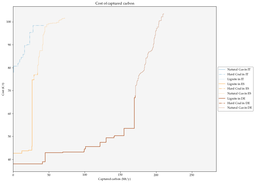
But maybe it is more interesting for you to see some granularity, for doing so we use the CurveCollection class. The way it works is by calling a constructor giving ISO codes of the territories we want to work with and the carbon sources to consider
fig , ax = plt.subplots(figsize=(12,10))
collection = CurveCollection.from_boundaries(distribution, ["DE", "ES", "IT"], ["Hard Coal", "Natural Gas", "Lignite"])
collection.plot(ax)
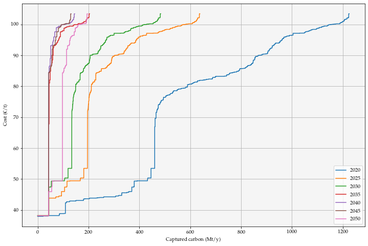
Scenario representations
The scenarios used in this tool are built based on the GECO scenarios, there are 3 of them a “Reference” scenario, “1.5°C” scenario and a “2C_M” scenario. To see the curves run:
from autumn.plots import produce_scenario_collection
fig, ax = plt.subplots(figsize=(12,8))
scenarios = scenario_development_one_hot_encoded("basic", "New Normal")
produce_scenario_collection(scenarios, "New Normal", ax)